Chart · Our World in Data
ChartOur World in Data
Annual birth rate and peak birth month
For each year, the peak birth month (month with the highest average number of births per day) is colored. The y-axis shows the annual number of births per 1,000 people.
Copy actions record publisher intent only. They do not confirm publication, citation or a backlink.
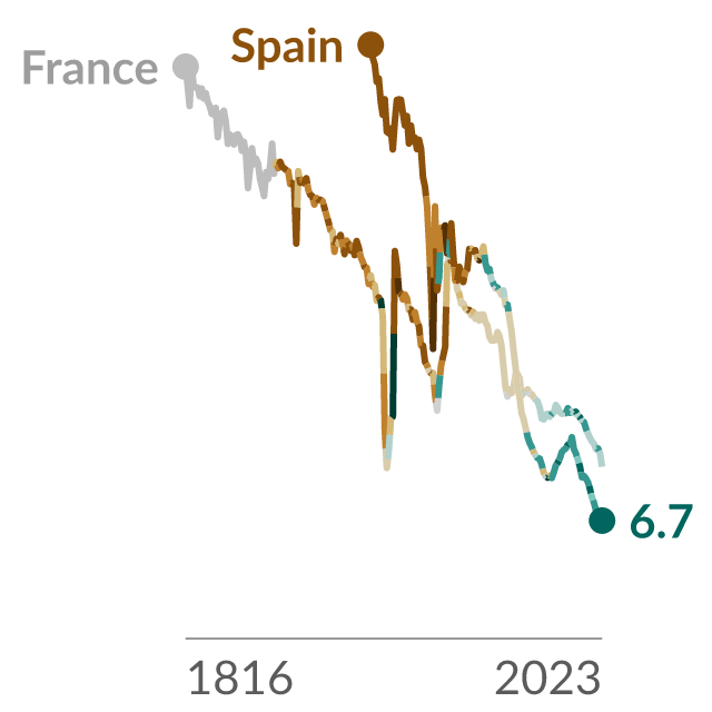
Data visualization loaded directly from Our World in Data.
Reuse conditions
Usage rights
- Source-hosted embed use
- Commercial use
- Modification
- Attribution
- Citation
- Raw-data redistribution
Chart and embed permission is separate from raw-data redistribution. The raw dataset is not included in this marketplace asset unless that right is explicitly marked allowed.
View rights evidencePublisher workflow
Exact citation
Human Mortality Database (2025)
Attribution: HMD
Source-hosted only
Embed instructions
<iframe src="https://citesupply.com/e/birth-rate-colored-by-peak-birth-month" title="Annual birth rate and peak birth month" loading="lazy" referrerpolicy="strict-origin-when-cross-origin" sandbox="allow-scripts" style="width:100%;height:720px;border:0;display:block"></iframe>
Embeds stay hosted by the source. Cite Supply records an aggregate iframe-load signal before redirecting to the reviewed source embed; it does not proxy or republish the chart.