Chart · Our World in Data
ChartOur World in Data
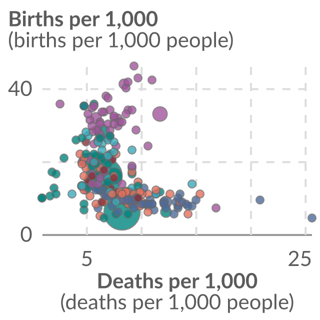
Birth rate vs. death rate
Rates are given per 1,000 people in the country's population. Countries above the gray line have a higher birth than death rate, meaning that the total population is increasing; those below the line have a declining population.
Copy actions record publisher intent only. They do not confirm publication, citation or a backlink.
Data visualization loaded directly from Our World in Data.
Reuse conditions
Usage rights
- Source-hosted embed use
- Commercial use
- Modification
- Attribution
- Citation
- Raw-data redistribution
Chart and embed permission is separate from raw-data redistribution. The raw dataset is not included in this marketplace asset unless that right is explicitly marked allowed.
View rights evidencePublisher workflow
Exact citation
UN, World Population Prospects (2024)
Attribution: Our World in Data
Source-hosted only
Embed instructions
<iframe src="https://citesupply.com/e/birth-rate-vs-death-rate" title="Birth rate vs. death rate" loading="lazy" referrerpolicy="strict-origin-when-cross-origin" sandbox="allow-scripts" style="width:100%;height:720px;border:0;display:block"></iframe>
Embeds stay hosted by the source. Cite Supply records an aggregate iframe-load signal before redirecting to the reviewed source embed; it does not proxy or republish the chart.