Chart · Our World in Data
ChartOur World in Data
Life satisfaction vs. life expectancy
The vertical axis shows life expectancy at birth. The horizontal axis shows self-reported life satisfaction in the Cantril Ladder (0-10 point scale with higher values representing higher life satisfaction).
Copy actions record publisher intent only. They do not confirm publication, citation or a backlink.
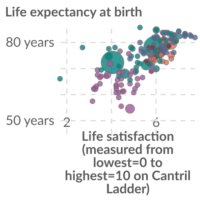
Data visualization loaded directly from Our World in Data.
Reuse conditions
Usage rights
- Source-hosted embed use
- Commercial use
- Modification
- Attribution
- Citation
- Raw-data redistribution
Chart and embed permission is separate from raw-data redistribution. The raw dataset is not included in this marketplace asset unless that right is explicitly marked allowed.
View rights evidencePublisher workflow
Exact citation
UN, World Population Prospects (2024); Wellbeing Research Centre (2026)
Attribution: WHR
Source-hosted only
Embed instructions
<iframe src="https://citesupply.com/e/life-satisfaction-vs-life-expectancy" title="Life satisfaction vs. life expectancy" loading="lazy" referrerpolicy="strict-origin-when-cross-origin" sandbox="allow-scripts" style="width:100%;height:720px;border:0;display:block"></iframe>
Embeds stay hosted by the source. Cite Supply records an aggregate iframe-load signal before redirecting to the reviewed source embed; it does not proxy or republish the chart.